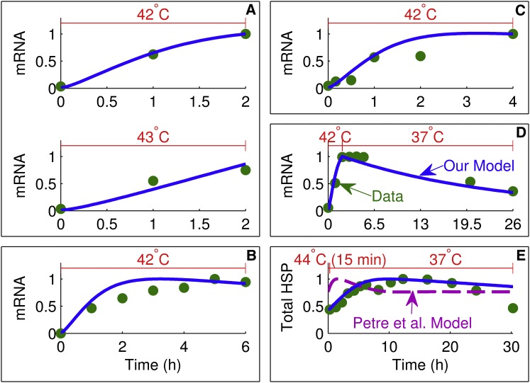
Figure 4.
Comparison of model simulations with HSP transcription and translation data. Each heat-stress temperature at the top, experimental data (circles), our model simulation (solid line), and the model simulation of Petre et al. (16) (dashed line). Results from the model of Petre et al. (16) are only shown in (E) because (A)–(D) correspond to the mRNA variable, which was not included in their model. Each box enclosing one or more plots is denoted by a letter and represents either one experiment or experiments from the same study plotted on the same scale: A (19), B (21), C (24), D (21), and E (26). To see this figure in color, go online.

