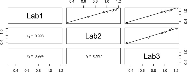
FIG 1.

Scatter plots showing the correlation of IgG antibody concentrations between laboratories for the seven serotypes using 007sp with the log IgG concentration of the values represented on the x and y axes. The three panels in the lower left corner show the rc value for each comparison. For example, rc = 0.994 for the comparison between laboratories 1 and 2. The three panels in the upper right corner show a graphical representation of the comparison of each pair of laboratories. Each point on the charts represents the mean of approximately 80 log IgG antibody concentrations for 007sp for a given serotype from each laboratory being compared. The solid diagonal line indicates theoretical perfect agreement, where the slope is 1 and the intercept is 0.
