
Figure 2.
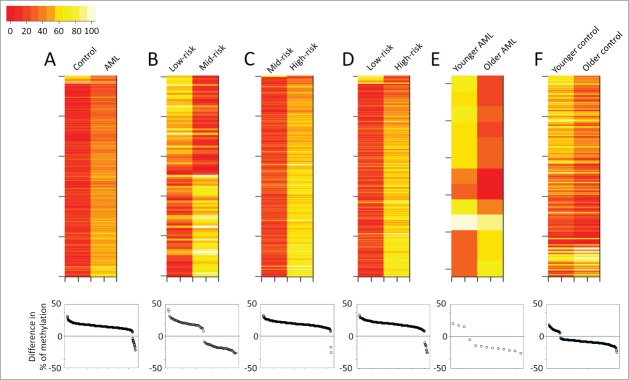
Overview of the CHARM analyses performed in the current study. Each panel presents results from a pairwise comparison: (A) Normal control vs. all AML; (B) low-risk vs. mid-risk AML; (C) mid-risk vs. high-risk AML; (D) low-risk vs. high-risk AML; (E) younger vs. older AML; and (F) younger vs. older control. Top: heatmaps of all the differentially methylated regions (DMRs) that distinguish the 2 groups, with each row representing a DMR. Bottom: Dot plots presenting the average methylation difference of each DMR generated using this pairwise comparison. Dots above the 0 line (blue) denote DMRs with higher methylation in the group on the right side of the corresponding heatmap.