
Figure 1.
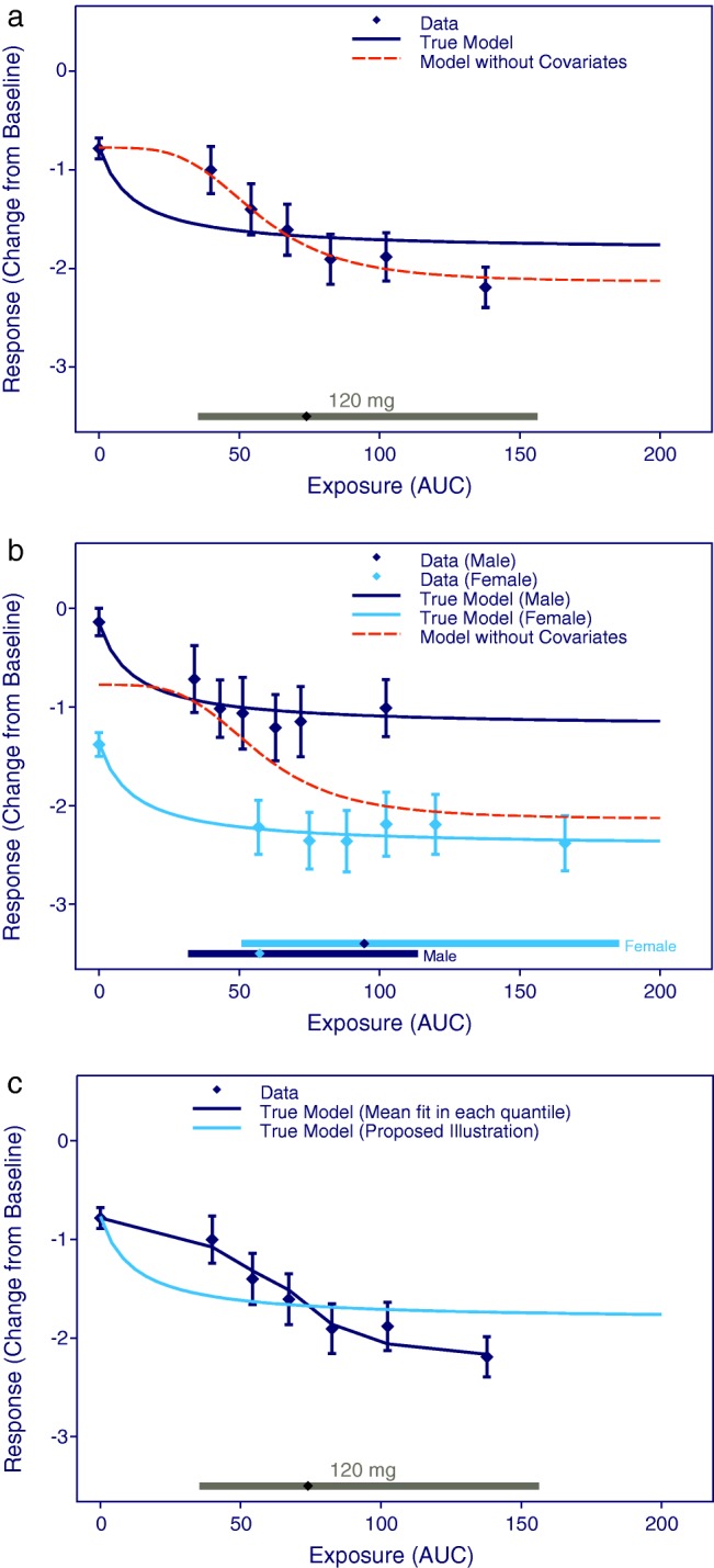
Visualization of E-R relationships (a) without and (b) with stratification for a confounding covariate (gender). (c) The proposed method for model visualization compared to the model fit for each quantile. Data points are mean effects with 95% CIs for quantiles of AUC values and the lines represent the estimated E-R relationships. The horizontal lines with diamonds along the abscissa represent medians and 90% exposure ranges at each dose level. The three panels are based on identical datasets generated by simulation of 1,000 subjects equally distributed between males and females.