
Figure 3.
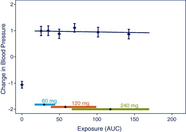
Plot to visualize the analysis used to test if already established effects increase with dose in the studied dose range. Data points are mean and 95% CI of effects for quantiles of AUC values. The vertical lines with diamonds along the abscissa represent medians and 90% exposure ranges at each dose level. Data were simulated with 240 subjects at each dose level or placebo.