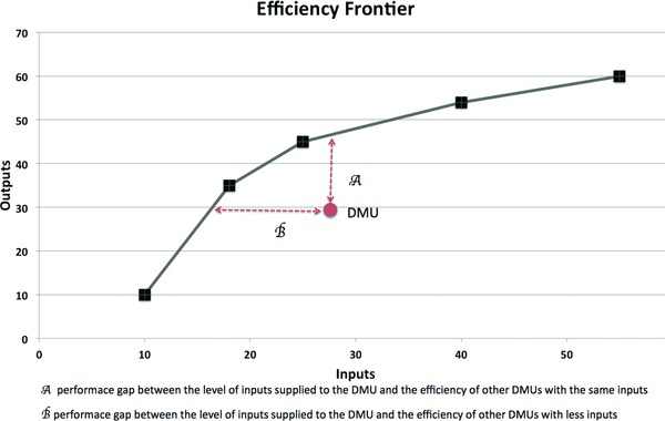
Figure 1.

Sample DEA for DMUs with one input and one output. The figure shows an example of efficiency and inefficiency. In this example, the x‐axis represents the inputs (for example, funds and services supplied for a project) the y‐axis is the outputs (for example, number of publications and new grants from a project), DMUs (funded projects) are represented by boxes and circle, and the efficiency frontier, computed by DEA, is represented by the black boxes linked by the black line. The red circle represents a DMU not at the efficiency frontier, hence a project that either underperformed for the level of inputs (A) or was over funded for the level of outputs (B) relative to other projects. It is expected that most DMUs in a data set will have some level of inefficiency and, with further statistical analysis, it is possible to determine how to better allocate scarce input resources. For example, once DEA has computed an efficiency frontier, it is possible to use more typical statistical techniques, such as regression analysis. This analysis would use the efficiency frontier value for each project as the dependent variable and the inputs as independent variables.
