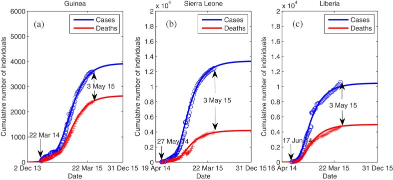
Figure 2. Model fit to the Ebola data in Guinea, Sierra Leone and Liberia.

Data of the cumulative numbers of infected cases and deaths are shown as blue circles and red pluses, respectively. The solid line represents the best fit to the data.

Data of the cumulative numbers of infected cases and deaths are shown as blue circles and red pluses, respectively. The solid line represents the best fit to the data.