
Figure 3. The estimated number of weekly total reported cases in the fitted model (red solid lines) and time-series data of the weekly number of confirmed cases (blue bars) reported by the WHO.
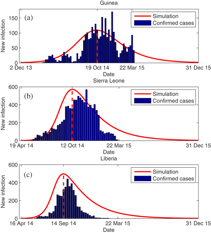
1. The vertical red dash line indicates when the epidemic reached the peak.