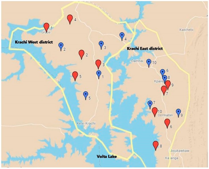
Figure 1.
Geographical allocation of intervention and control communities. The yellow lines show the target districts. The numbered balloons represent the study communities of the matched pairs: blue for the intervention groups, red for controls. The white lines indicate the main roads in each district.

