
Figure 3. Relative abundance profiles of functionally categorized gene transcripts.
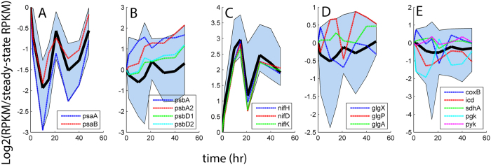
Solid black lines indicate the mean profile taken from each collection of genes. Edges of each shaded region represent the respective maximum and minimum relative abundances of transcripts measured at each sampling point. (A) PS I (11 psa genes); (B) PS II (31 psb genes); (C) Nitrogenase (20 nif genes); (D) Glycogen metabolism (8 glg genes); (E) Catabolic energy metabolism (18 genes involved in glycolysis, TCA and oxidative phosphorylation).