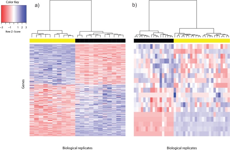
Figure 1. Heat map of differentially expressed genes in (A) Bottomly data set (362 DEG) and (B) Cheung data set (19 DEG).
Phenotype class legend: (A) Black for DBA/2J strain (n = 11); yellow for C57BL/6J strain (n = 10). (B) Black for female (n = 17); yellow for male (n = 24). The heat maps were made using the gplots (Warnes et al., 2014) R package. Pairwise sample distances were estimated using the Euclidean distance and sample clustering was done using the Ward algorithm. The DEG were sorted based on the magnitude and sign of their t-statistic.

