Figure 3.
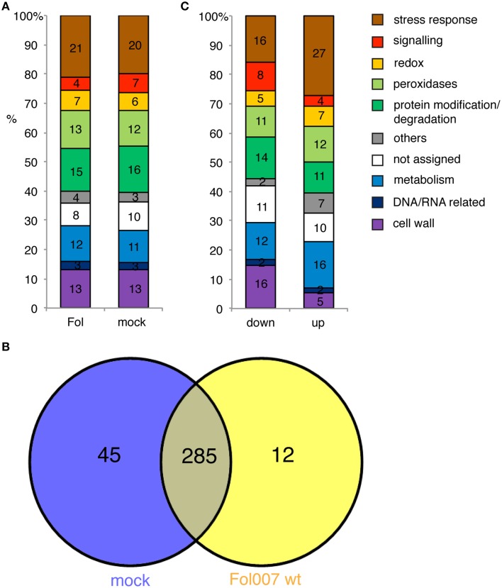
The identity of the xylem sap proteome in mock-treated and Fol-inoculated plants is similar. (A) Bar chart showing the percentage of xylem sap proteins per GO category for Fol-inoculated and mock-inoculated plants. (B) Venn-diagram representing the number of overlapping and individual proteins of the mock and Fol proteome. (C) Bar chart depicting all different accumulated proteins (DAPs) in the Fol vs. mock contrast depending on whether the protein abundance was decreased (down) or increased (up).

