Figure 4.
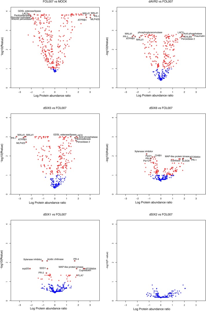
The number of DAPs differs substantially between the different contrasts that were tested. Volcano plots showing the relation between -log10 False Discovery Rate-corrected P-values and log10 protein abundance ratios, based on the group average per treatment from the linear model fit. Blue circles indicate proteins that are not differential while red circles were annotated as DAPs. The black encircled DAPs, with names included, represent the top-10 combinations of lowest P-value and strongest up- and down-regulated proteins of Fol compared to Mock (top left), dAVR2 compared to Fol (top right), dSix5 compared to Fol (center left), dSix6 compared to Fol (center right), dAvr3 compared to Fol (bottom left) and dSix2 compared to Fol (bottom right). Names of the proteins can be found in Table 2.

