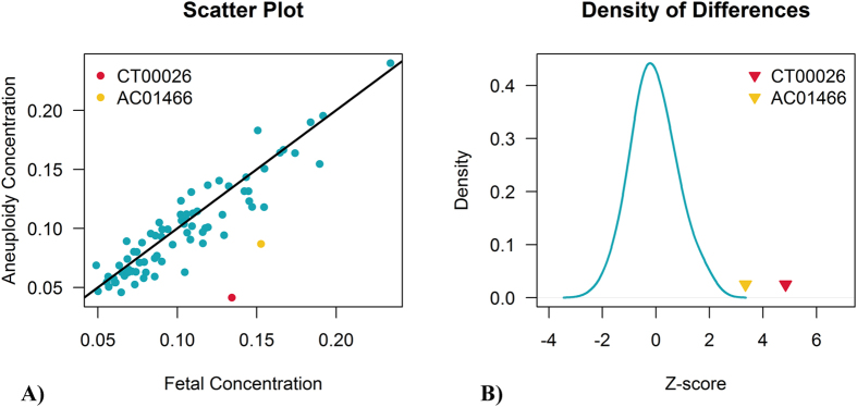
Figure 5.

Scatter plot of two fetal concentrations (A) and the density of their differences (B). A) scatter plot showing the differences of two fetal concentrations. The x-axis represents fetal concentrations calculated from chromosome X; the y-axis shows fetal DNA fractions estimated from their aneuploid chromosomes. (B) density of the differences between two fetal concentrations. The blue solid line shows the difference distribution of positive samples. The false-positive samples CT00026 and AC01466 are colored in red and yellow respectively.
