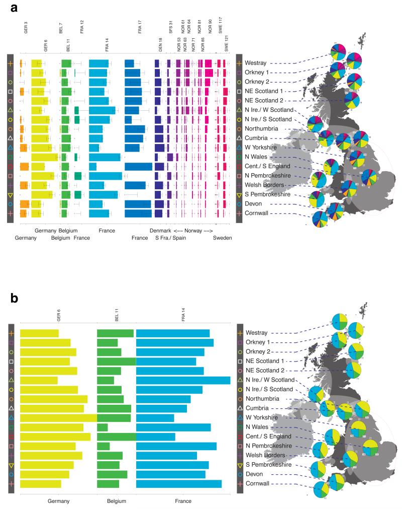
Extended Data Figure 7. European ancestry profiles of the UK clusters.
a, The map of the UK shown relates to the map with 17 UK clusters shown in Fig. 1. Ellipses indicate the extent of the UK clusters as in Fig. 1. The pie charts represent the ancestry profile of the UK clusters from Fig. 1. Each pie chart is plotted at the centroid of the corresponding cluster, although some pie charts have been moved for clarity; in the cases where the relocation is substantial a red line leads from the pie chart to the centroid. The sectors of the pie charts are coloured with the colours of the European genetic groups (for the larger sectors the number of the European group is also given). They indicate the ancestry profiles of each UK cluster, namely the proportion of the cluster ancestry that is best represented by each of the European groups. The magnitude of the angle of a sector is proportional to the contribution of that European group to the ancestry profile of the associated UK cluster. The symbols in the grey bar to the left of the map represent the UK clusters as in Fig. 1. The bar chart in the left part of the plot depicts the same ancestry profiles of the UK clusters in a different way. Each row represents a UK cluster (arranged roughly north to south) with the symbols for the clusters from Fig. 1 indicated at each end of the row. Each column represents a European group, with group numbers listed with a three letter prefix that, for clarity, relates to the country or countries where the cluster is most represented. The colour of each bar also indicates the European group to which the bar relates. Confidence intervals (95%) obtained from 1,000 bootstraps of the ancestry profile analysis (see Methods) are indicated on each bar. b, Renormalized ancestry profiles of the UK clusters illustrating possible early European contributions to the UK population. A representation of the relative contributions to the UK clusters from the three European groups (GER6-W. Germany, BEL11- Belgium, and FRA14-NW France) hypothesized to be the major contributors to the earliest migrations into the UK after the last ice age from which DNA survives to the present in substantial proportions (see Supplementary Note). Interpretation of the map, pie charts and bar chart is as for a. In this case, however, the proportions were renormalized to sum to 1 for the contributions from GER6, BEL11 and FRA14.

