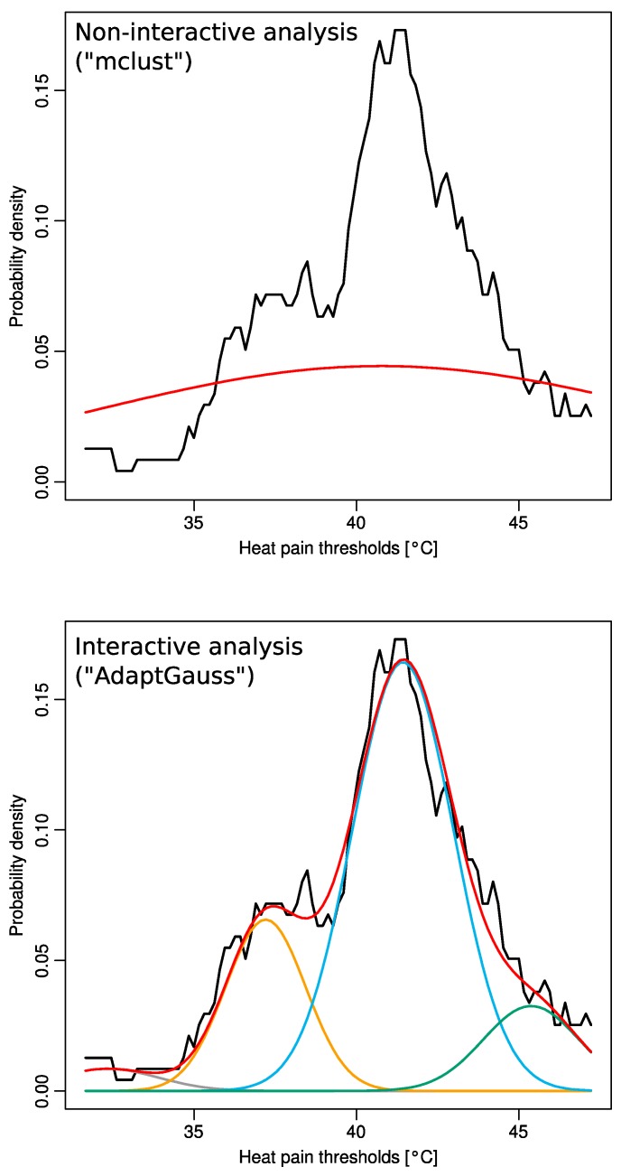
Figure 3.
Distribution of heat pain thresholds acquired from 127 volunteers (rescaled for body area and sex). The distribution is shown as the probability density function (PDF), estimated by means of the Pareto Density Estimation (PDE [11], black line in both panels). The red line shows the Gaussian distribution of the data. Using noninteractive EM fitting of a GMM (R-library “mclust” [12]) resulted in only a single component of a Gaussian mixture (top panel, red line). By contrast, interactively adapting a GMM (“AdaptGauss”) resulted in a substantially better multimodal Gaussian mixture (brown, orange, blue and green lines) describing the overall data distribution satisfactorily (red line displaying the sum of the single Gaussians).

