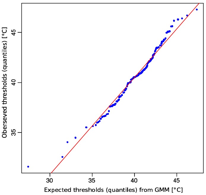
Figure 4.
Quantile-quantile (QQ) plot comparing the observed distribution of heat pain threshold data (ordinate) with the distribution expected from the GMM (abscissa), which was fitted to the data as shown in Figure 3 bottom. The blue dots symbolize the quantiles of single observations versus predictions and the red line indicates identity.

