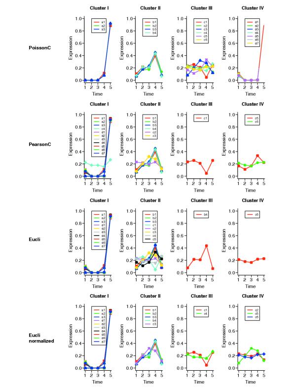
Figure 1.

Graphs of clustering results for simulation data. The x-axis represents the different time points; the y-axis represents the expression level scaled as percentage. Data were normalized before plotting. For each tag, the count vector is rescaled to make the sum of the elements of the count vector equal 1. For example, b4 = (109,306,296,620,93) is rescaled to b4' = b4/θ where θ = (109 + 306 + 296 + 620 + 93).
