
Figure 2.
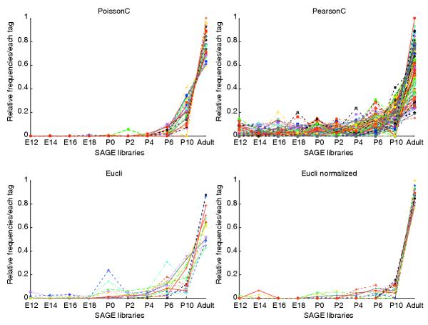
Graphs of clustering results for mouse retinal SAGE data. The x-axis represents the time points of the developing mouse retina SAGE libraries; the y-axis represents the relative frequency for each tag scaled as a percentage. Data were normalized before plotting. Each tag from the 10 libraries was rescaled to make the sum of all 10 tags equal to 1. Different colors represent different tags. See Additional data file 1 for more details.