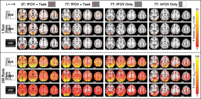
Figure 3.
Maps of activation (pFDR < 0.05) for Nruns = 1 (top 3 rows) and 100 (bottom 3 rows) across subjects and response models. Columns correspond to single subjects, and rows show results from different response models. The “SUS,” “OSO,” and “UNC” rows show significantly active F statistics for those models with yellow indicating stronger activation. Activation extent increases from Nruns = 1 to 100 and decreases from left to right due to differences in quality between 3T and 7T data and lower task demands in “fFOV Only” and “hFOV Only” conditions.

