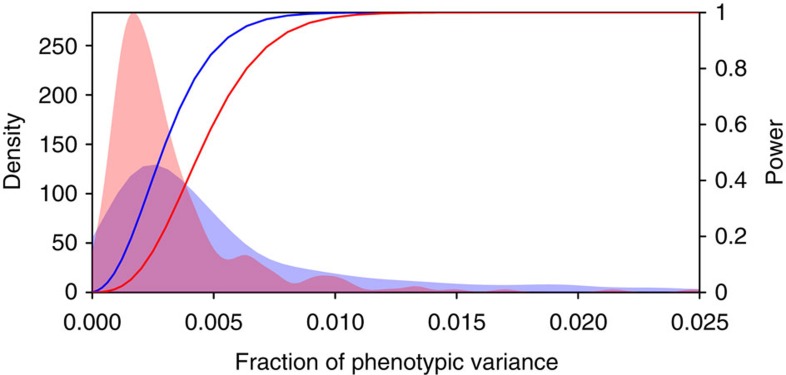
Figure 4. Distribution of genetic effects and power to detect them.
A density plot of the fraction of phenotypic variance (x axis) explained by individual significant QTL (blue area) and QTL–QTL interactions (red area) across all traits. The curves correspond to the statistical power at a genome-significance threshold (right, y axis) for QTL (blue) and QTL–QTL interactions (red).

