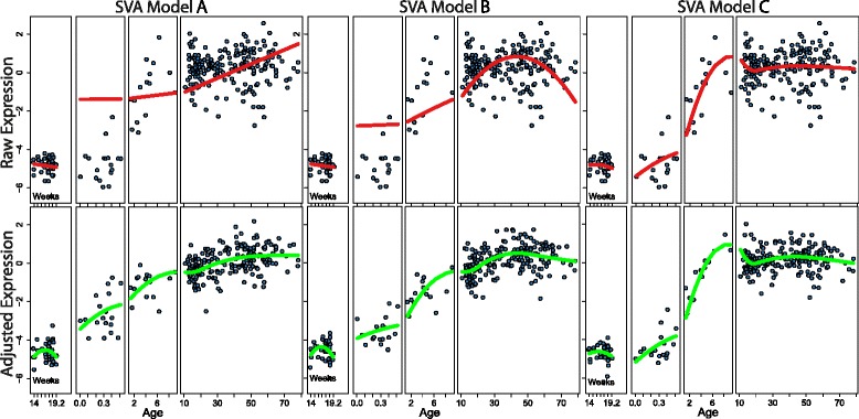
Fig. 5.

Individual gene view of the impact of differing models in SVA. CNDP1 gene expression is shown in the original normalized data (“Raw”) in the top panels. Each of the 3 different models used for SVA are shown overlaid on this original data in the top panels. This fit represents the effect that SVA will preserve for this particular gene in each of the 3 different scenarios (red). Bottom panels show CNDP1 gene expression adjusted with SVs generated using each of the 3 different models. Smoothing splines for expression across age are shown for each to depict the difference in expression patterns present when using SVA under the different models (green)
