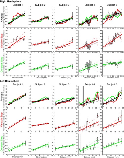
Fig. S5.
Progression of preferred object size with distance along the map (shown in Fig. S4) for both stimulus conditions and the average data for each subject. Points represent the mean preferred object size in each distance bin, with error bars representing the SE. Solid lines are the best linear fit to the bin means. Dashed lines represent 95% confidence intervals determined by bootstrapping fits to the bin means. Object size preferences increase significantly across the map, at P = 0.01 or less in each hemisphere (permutation analysis).

