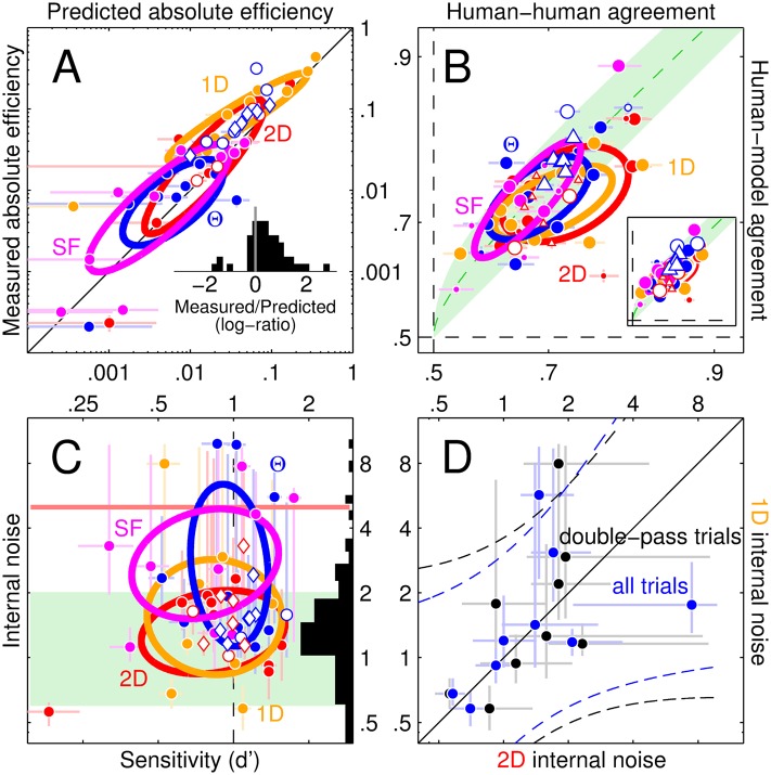
Fig 4. Human intrinsic variability is compatible with a linear model followed by a late additive noise source.
The absolute efficiency predicted by the LN model (x axis in A) matches corresponding human estimates (y axis). Inset to A plots distribution of log-ratios between measured and predicted values (0 when not different). Trial-by-trial agreement between human responses and LN model (y axis in B) falls within the optimal range (indicated by green shading; green dotted line shows midpoint between upper and lower boundaries); inset shows similar results for gain-control model (diagram in Fig 6A). Symbol size in B reflects associated decoupled baseline (small size for baseline≤chance, big for baseline>chance; see S1 Text for details on how baseline was computed). Axes have been stretched to map linearly in d′ units. Internal noise estimates (see Methods) plotted on y axis in C (see also side histogram) are broadly consistent with measurements from previous studies [27] (range indicated by green shading) and do not correlate with sensitivity (x axis), as expected of an additive noise source. Red horizontal line marks cut-off point (value of 5) beyond which internal noise estimates represent estimation failures [27]. Estimates for 2D (x axis in D) versus 1D noise from the detection task are mildly correlated across observers (dashed lines show ±95% confidence intervals on linear fit) but do not differ (data points scatter around solid unity line), consistent with a late common noise source (an earlier noise source may be expected to scale with noise dimensionality [28]). Black/blue symbols in D show estimates obtained by computing the percentage of correct responses from double-pass blocks only (black) or all blocks (blue) to demonstrate that this choice had little impact on the resulting trend. In all remaining panels, solid/open symbols refer to detection/discrimination tasks and different colours refer to different noise types (red for 2D, yellow for 1D, blue for orientation, magenta for SF). Diamond shape refers to the symmetric variant of the discrimination experiment. Each symbol refers to data from an individual observer in the condition specified by its colour/shape characteristics. Error bars show ±1 SEM in all plots (omitted in inset to B to avoid clutter); ovals are centred on mean across data points, with axes tilted along linear fit and spanning ±1 SD of projected data values.

