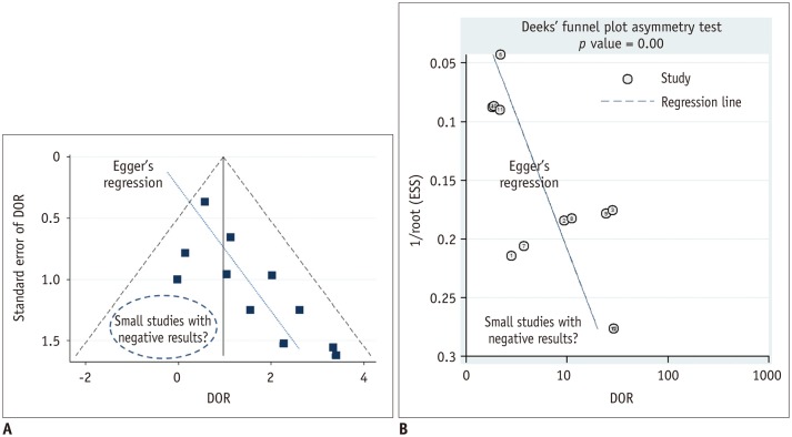
Fig. 6. Funnel plot to assess publication bias.
A. Funnel plot with Egger's regression line. Each dot represents primary study. X-axis shows study result (i.e., diagnostic odds ratio [DOR]) and y-axis represents study size (i.e., standard error of study result). Empty region, to be filled with results of relatively small studies with negative results or small effect size, makes plot asymmetrical. Asymmetry of plot would indicate that such studies may not ever have been published, thus raising possibility of publication bias being presented as review result. B. Deeks funnel plot. In Deeks funnel plot, x-axis is natural logarithm of DOR and y-axis is 1/√ effective sample size (ESS). According to Deeks et al. (35), it is preferred method for meta-analysis of diagnostic test accuracy studies owing to its high statistical power.

