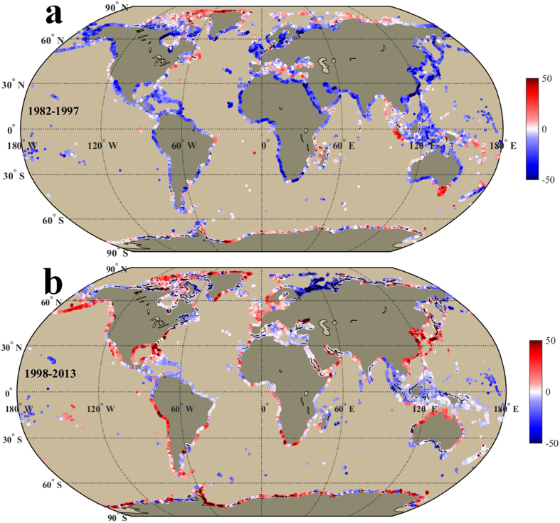
Figure 4.
Same as Fig. 2, but shows the linear trend (days/decade) of annual frequency of extremely cold days in the warming (1982–1997, a) and hiatus periods (1998–2013, b). Black points/lines in the shading color indicate the trends in those locations are significant in statistics (P < 0.05). We generated the two sub-panels (a,b) using Matlab and integrated the sub-panels into this figure.

