
Fig. 4. Molecular differences between different CO2 treatments.
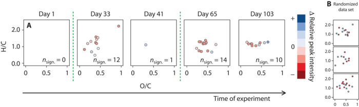
(A) Exemplary van Krevelen diagrams showing only the molecular formulae (out of 7360) that significantly varied in their intensities between the five high PCO2 and control mesocosm replicates, tested for the respective day (P < 0.001). The different colors represent differences in normalized relative peak intensity: blue dots indicate an increase in peak intensity, whereas red dots indicate a decrease in peak intensity. Green dashed lines represent time points of phytoplankton blooms. (B) The results are within the statistical error, determined by performing the same test on a randomized data set.