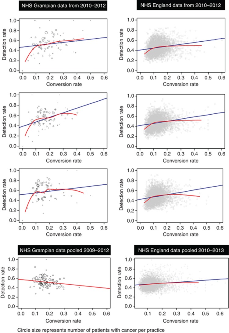
Figure 1.
Scatter plots of detection rate vs conversion rate in different years, and aggregated across all available years, for each database. Lines indicate linear regression (blue) and local polynomial regression (red). Northeast Scotland data points (N=77) represent the practice size. A full colour version of this figure is available at the British Journal of Cancer journal online.

