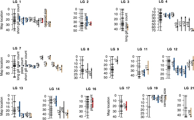
Figure 2.
Map of candidate QTL. Map of 58 candidate QTL (i.e., QTL with an effect in one or both lakes). Linkage groups on which QTL were detected are shown. For each, the positions of SNPs markers in the combined Paxton and Priest linkage map are depicted by tick marks on the left. Colored bars span the 1.5-LOD confidence intervals of candidate QTL. Black dots within bars represent the peak marker position. The phenotype affected by each candidate QTL is indicated to the left of its bar. Colors of bars represent the “QTL effect” category, as follows: parallel effects, blue; effect in only one lake, gray; and opposite effects, red. Tan colored bars represent the candidate QTL for which more than one QTL effect category fit the data nearly equally well.

