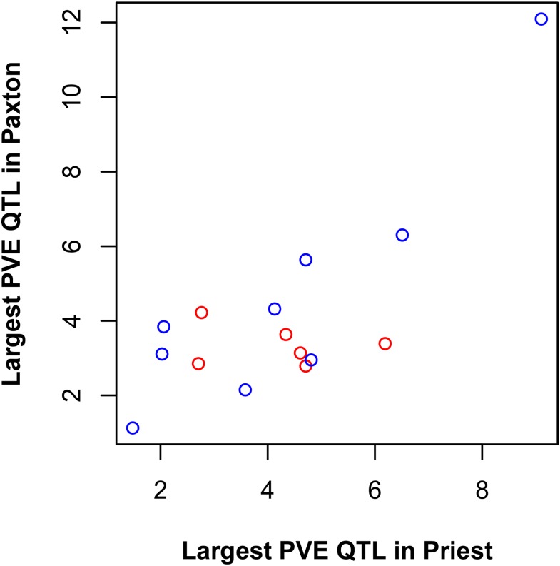
Figure 3.
QTL effect size and genetic parallelism. The horizontal axis shows the percent of the phenotypic variance explained (PVE) by the largest effect QTL in Priest Lake underlying each trait having at least one QTL in both lakes (N = 15 traits). The same for Paxton Lake is shown on the vertical axis. Blue dots represent cases where the QTL is the same (maps to the same genomic location) in both lakes. Red dots represent cases where the QTL is different (maps to different genomic locations) in the two lakes.

