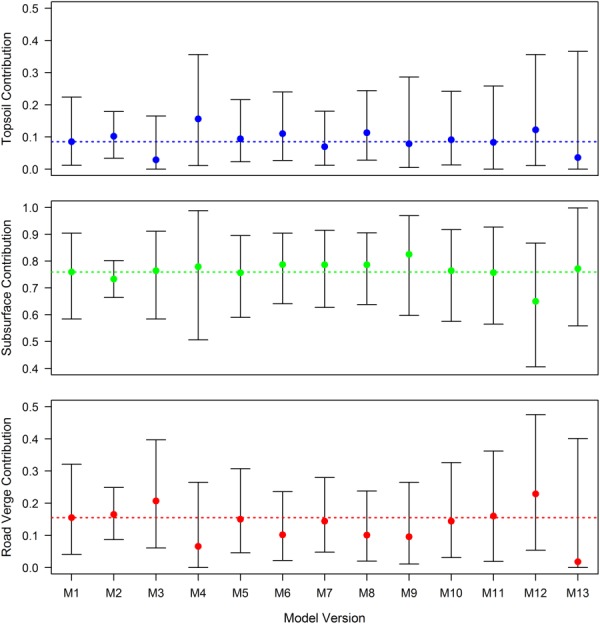
Figure 5.

Comparison of SPM source apportionment as estimated by 13 mixing model versions. Results for each version are displayed as the temporal apportionment average across all 40 SPM samples spanning August 2012 to August 2013. Points represent median contributions with associated 95% credible intervals, whilst dashed lines represent the median contribution estimated by M1.
