
Figure 4.
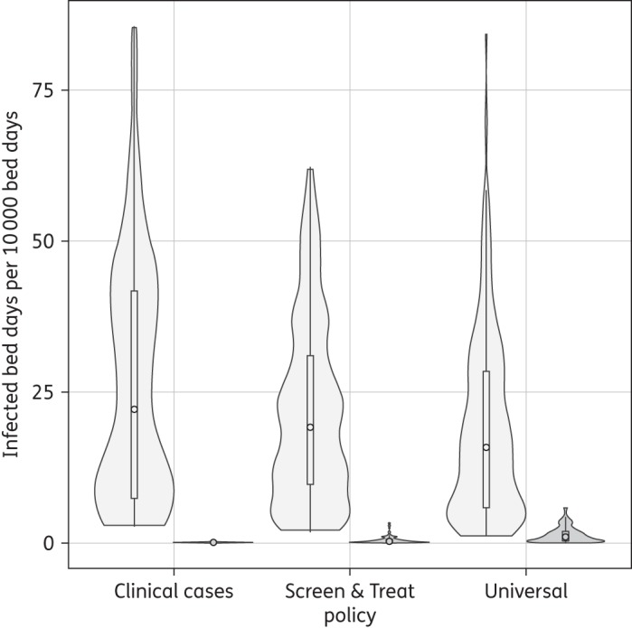
Violin plot showing the frequency distribution for number of infected bed days per 10 000 total bed days. MupS (grey) and MupR (dark grey) MRSA. The circle inside the box is the median and the bottom and top of the box are the first and third quartiles, respectively. Results are from simulations under baseline parameter assumptions as presented in Tables 2 and 3.