. 2015 Nov 19;12:E199. doi: 10.5888/pcd12.150297

Figure 1.

Figure 1 consists of 9 polygons, each representing a cluster of conceptually similar statements. The polygons form a circle with one cluster in the center and have been grouped into 3 distinct regions. The region containing the 5 clusters along the bottom of the map is labeled Intermediate Outcomes. Within this region, the cluster on the far left side of the map is labeled Enhanced Learning. Moving counter-clockwise, the next clusters in this region are labeled Improved Use of Resources, Enhanced or Increased Relationships, Improved Collaborative Action, and Network Cohesion. The region containing 3 clusters along the top of the map is labeled Long-Term Outcomes. Continuing counter-clockwise the clusters are Improved System Outcomes, Improved Population Health Outcomes, ending with Improved Practice and Policy Planning at the top of the circle. The final region in the center is labeled Bridging Cluster and contains a single cluster labelled Improved Intersectoral Engagement.

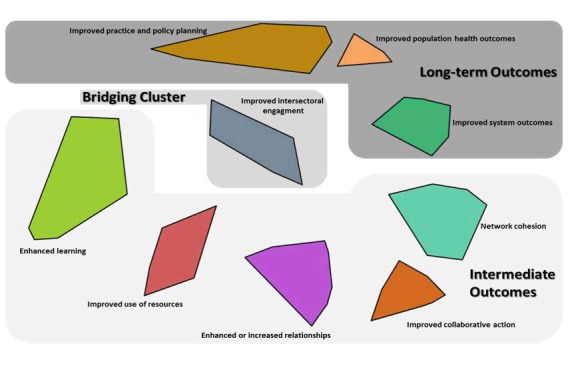
Cluster map showing regions (intermediate, bridging, and long-term outcomes).