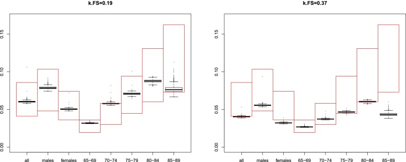
Fig. S2.
(Left and Right) Simulated and literature results on the prevalence of AF. The y axis shows AF prevalence. The x axis shows various gender and age subgroups. The large, red rectangles represent measured AF prevalences, taken from ref. 17, supplementary table 5. The top level of the range corresponds to year 2007 and the bottom level to year 1993. The whisker plots represent the distributions of the prevalences obtained for each scenario resulting from the Monte Carlo simulation of mortality rates for high- and low-risk AF. Left shows the results obtained with a uniform AF reversal rate of , whereas Right shows a value of (as reported in ref. 17). Ideally, the simulated prevalences (black whisker plots) at Left would be expected to occur toward the top, 2007 level of the measured prevalence range (top of the red box) whereas those at Right would occur toward the bottom, 1993 level. Systematic differences from the expected behavior need to be explained by further refinement of the model, but it can be seen that the uncertainty of the mortality coefficients that is attributable to small sample sizes cannot account for these differences.

