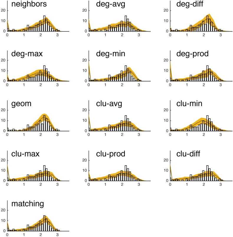
Fig. S17.
We show the observed betweenness centrality distribution (black bar plot) against the betweenness centrality distributions of the best-fitting synthetic networks generated with each model. In all panels, the x-axis indicates betweenness centrality (b) and the y-axis indicates frequency. It should be noted, that due the orders of magnitude difference between the most central and least central nodes, the x-axis has been log-transformed. This figure shows data from a single representative subject in the CHUV cohort.

