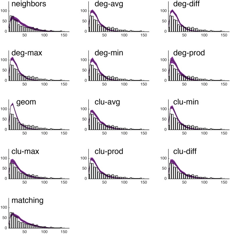
Fig. S18.
We show the observed edge length distribution (black bar plot) against the edge length distributions of the best-fitting synthetic networks generated with each model. In all panels, the x-axis indicates edge length (e) and the y-axis indicates frequency. This figure shows data from a single representative subject in the CHUV cohort. Note that of the models shown here, “matching” and “neighbors” do a reasonable job generating networks with a broad range of connection lengths. This is in stark contrast with the geometric model “geom,” which over-represents short range connections.

