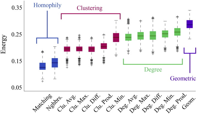
Fig. 2.
Energy distributions across all models. Each box plot represents the top 1% lowest energy synthetic networks generated by each model and aggregated across all participants. The color of each plot indicates the general class of the model: homophily is shown in blue, clustering in pink, degree in green, and geometric in purple. The specific wiring rule names are shown along the x-axis.

