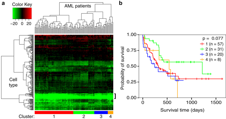
Figure 2. Exploratory analysis of Immunological Genome Project LSSs.
(a) Heatmap showing the pattern of 232 LSSs across the 116 samples from the Bullinger dataset. Each column represents one patient’s LSS profile for each of the 232 murine hematopoietic cell types from the Immunological Genome Project. Green is indicative of a lower (less similar) LSS while red is indicative of a higher (more similar) LSS. Patients tended to have lower LSSs in more differentiated cell types (bracket). Patient clusters were chosen based on patient location in the heatmap dendrogram (sidebar). (b) Kaplan-Meier plot depicting the survival probability over time for each cluster. Vertical hash marks indicate points of censored data. The four clusters did not show a significant difference in survival time (p > 0.05).

