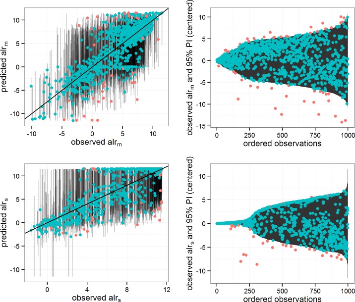
Fig 4. Observed and predicted values for 1,000 random observations from test set.
The left panels show predicted vs observed values for alr m and alr s along with prediction intervals. The diagonal line indicates y = x. The right panels show the observed values relative to the centre of prediction interval. Points are coloured according to whether the observed value is within the 95% prediction interval.

