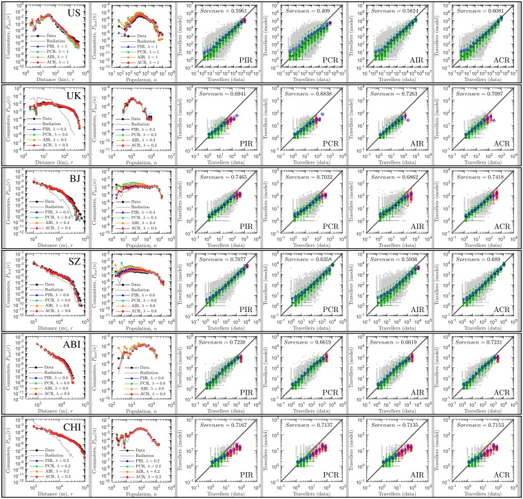
Fig 2. Comparing the predictions of the generalized radiation model and the real data.
In the first column, these panels display the overall travel distance distribution reported in the empirical data and the fitted models. It reveals the probability of a trip between two locations that are at distance r (in km) from each other, P dist(r). These distributions are generally collapsed with each other, indicating the predictions of the model are acceptable. In the second column, the panels display the distributions of fluxes associated with given population at destination or origin. It denotes the probability of a trip from or towards a location with population n, P dist(n). Again, agreements between the model output and the real data are observed. In columns 3 to 6, these panels compares the observed flux, T data, with the predicted flux, T model, for each pair of i, j counties where real travel flux exists. Note that gray points are scatter plot for each pair of locations. A box is colored green if the diagonal line lies between the 5th and the 95th percentiles in that bin and is red otherwise. The black circles correspond to the mean number of predicted travelers in that bin. In general, the generalized radiation model predicts travel fluxes in well agreement with the real data, except for flows with large volumes.

