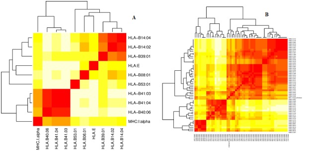
Figure 1.

Heatmaps of the MHCcluster. Figure A and B show the heatmaps for the MHC class I and II, respectively. The regions in red represent the warm regions where the alleles of MHC with similar capacity of anchor epitopes with high affinity, the regions of the color yellow represent cold spots where the similarity of affinity epitopes are more distant from each other. The intensity of color is related to the behavior of the predictive ability of epitopes between different MHCs.
