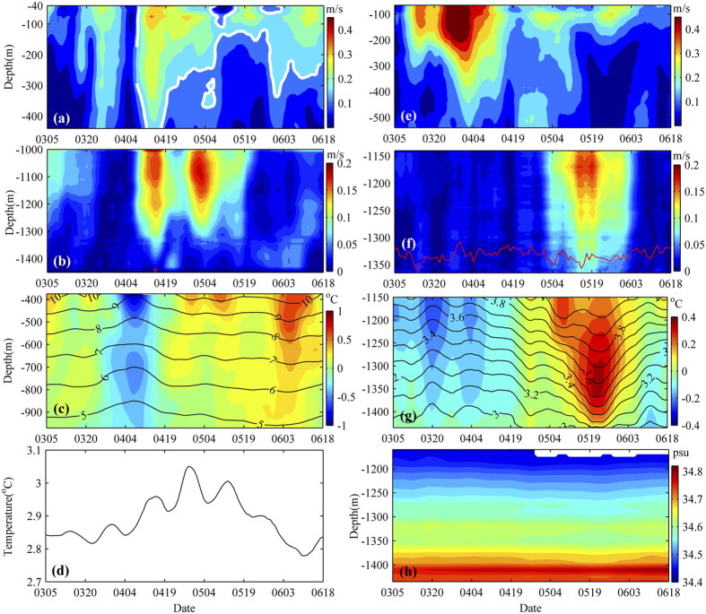
Figure 2. Current and hydrographic observations.
Time series of (a) 40–440 m and (b) 1000–1450 m horizontal velocity magnitude observed by mooring A from 5 Mar 2012 to 18 June 2012. Time series of (c) temperature (lines) and temperature anomaly (colors) and (d) temperature at around 1463 m from 5 Mar 2012 to 18 June 2012. (e–g) Similar as (a–c) but observed by mooring B at different depths. (h) Salinity time series at 1160–1435 m observed by mooring B from 5 Mar 2012 to 18 June 2012. White lines in (a) represent 0.15 m/s contour. Red lines in (b,f) represent 75% lines of good data obtained from ADCPs outputs. The data in the layers shallower than red lines have more than 75% good quality with values. Note that red line in (b) can only be observed around April 14, 2012 at about 1450 m. In this figure, different colorbars are used. Figures are plotted using MATLAB.

