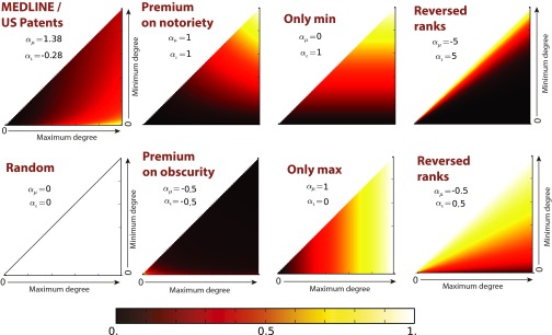
Fig. S5.
Degree–degree preference plots: empirical and alternative preferences. The x and y axes of each subplot correspond to the maximum and the minimum degree in a degree pair. The preferences (defined only by parameters and ; Fig. S4 and Eq. S5) are normalized so that the maximum preference on the plot is equal to 1 (white) and the minimum (if distinct from the maximum) is 0 (black). The first panel corresponds to the degree–degree preferences induced from data. Other panels compare this with alternative “strategies” or preferences.

