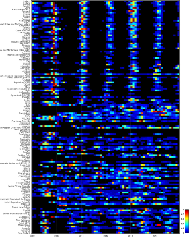
Figure 3. Heat map of monthly influenza virus incidence patterns in 125 countries, 2009-2014, sorted by latitude of the capital cities. Color bar represents the intensity of influenza incidence, from high (red) to low (blue).
Monthly incidence counts were standardized annually, and shown as the proportion of the maximum number of cases in a month for that country and period (hence, months with the maximum number of cases for a given year were assigned the value 1). Year 2009 was excluded from seasonality analyses due to the A/H1N1 pandemic emergence. Data source: FluNet5,26. Visualization: Epipoi28.

