Figure 4.
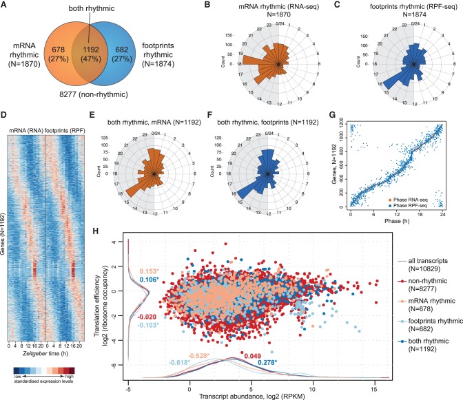
Transcriptome-wide analysis of transcript abundance and ribosome occupancy rhythms. (A) Venn diagram summarizing the result of rhythmicity detection in the RNA-seq and RPF-seq data. Of a total of 10,829 expressed protein-coding loci, 1870 showed mRNA rhythms and 1874 had footprint rhythms (in both cases 17% of all) with a >1.5× peak-to-trough amplitude (FDR < 0.05); 1192 transcripts were common to both sets. (B) Phase histograms for the transcripts in A, showing the peak phase distribution of mRNA abundance (RNA-seq) rhythms over the 24-h cycle in orange. The length of the spoke indicates how many transcripts peaked at a specific time. (C) As in B for footprint rhythm (RPF-seq) in blue. Note the different phase distribution of ribosome occupancy rhythms compared with RNA abundance rhythms depicted in B. (D) Heat map of rhythms at the level of mRNA abundance (RNA-seq; left) and footprints (RPF-seq; right) for the overlapping set from A (1192 genes). Transcripts are sorted by the phase of maximal ribosome occupancy. For the representation, mRNA abundances and translation levels are standardized within each gene (row) and independently for RNA-seq and RPF-seq columns (Z-scores). (E) Phase histograms showing the phase distribution of “mRNA and footprints rhythmic” transcripts from the overlap in A (N = 1192) for mRNA accumulation (RNA-seq) in orange. (F) As in E, but for footprints (RPF-seq) in blue. Note that the distribution is near-identical to that in E. (G) Phase correlation plot of the “mRNA and footprints rhythmic” genes (N = 1192). Each row contains two dots marking the phase of maximal mRNA abundance (orange) and the phase of maximal footprints (blue) for each gene. Genes are ordered according to the phase of the mRNA. (H) Scatter plot of TE versus transcript abundances for the genes classified into the different rhythmicity categories shown in A (values averaged over timepoints and replicates). Density curves are plotted on the margins with the same color code. Numbers on density curves reflect the location shift (log2 values) relative to all transcripts (gray). (*) Significance at the 0.05 level (Wilcoxon rank-sum test). The plot shows that rhythmic genes (i.e., those with rhythmic mRNAs [light salmon], with rhythmic footprints [light blue], or with rhythmic mRNA and footprints [dark blue]) are significantly different at the level of TE and of transcript abundances than transcripts of nonrhythmic genes (red).

