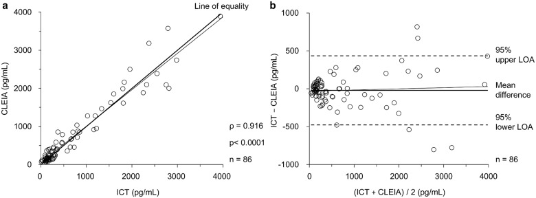
Fig 3. Scatter plot and Bland–Altman plot for comparison between CLEIA and quantitative ICT.
(a) Scatter plot between CLEIA and quantitative ICT for whole blood (n = 86). Circle dots represent each point, the thick line represents the line of equality, and the thin line represents the regression line. (b) Bland–Altman plot between CLEIA and quantitative ICT for whole blood (n = 86). Circle dots represent each point, the thick line represents the mean difference, the broken lines represent the 95% upper LOA or the 95% lower LOA, and the thin line represents the regression line.

