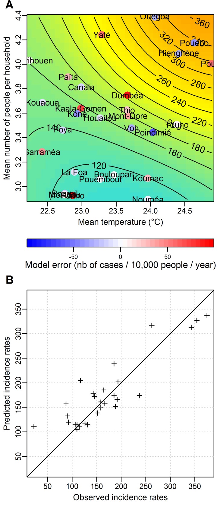
Fig 5. Results of the best multivariable model of the spatial structure of dengue incidence rates.
A: Predicted mean (across epidemic years) annual incidence rates as a function of the two best explanatory variables (mean temperature and mean number of people per premise). The axes represent the value of the two best explanatory variables. Predicted average annual incidence rates are represented by the colour (blue for low incidence rates to orange for high incidence rates) and by the contour lines giving incidence rates in number of cases per 10,000 people per year. Each commune that has been used to build the model is placed on the graph according to the observed value of the two explanatory variables in the commune. Its position on the graph hence provides the average (across epidemic years) annual incidence rate in the commune as predicted by the model. For each commune, the coloured dot represents the difference between the predicted and the observed incidence rate (model error). B: Scatter plot of the predicted and observed average (across epidemic years) annual incidence rates for each of the 28 communes. The RMSE of this model is 45 cases per 10,000 per year.

