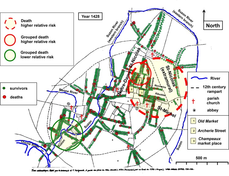
Fig 4. Cartography of death in 1428.
Georeferenced map of medieval Dijon. Rivers as blue lines. Parish churches, abbeys and a number of prominent places are indicated. The 12th century rampart is shown by dotted lines. Each point corresponds to a surviving head of household (green points) or to a registered death (larger red points). Yellow area circled in dotted red line: spatial cluster where the relative risk of death doubled. Yellow area circled in solid red line: cluster with a higher relative risk of grouped death. Yellow area circled in green: cluster with a null relative risk of grouped death. Historical evidence of the location of the statistically significant clusters is presented in S10 Text.

