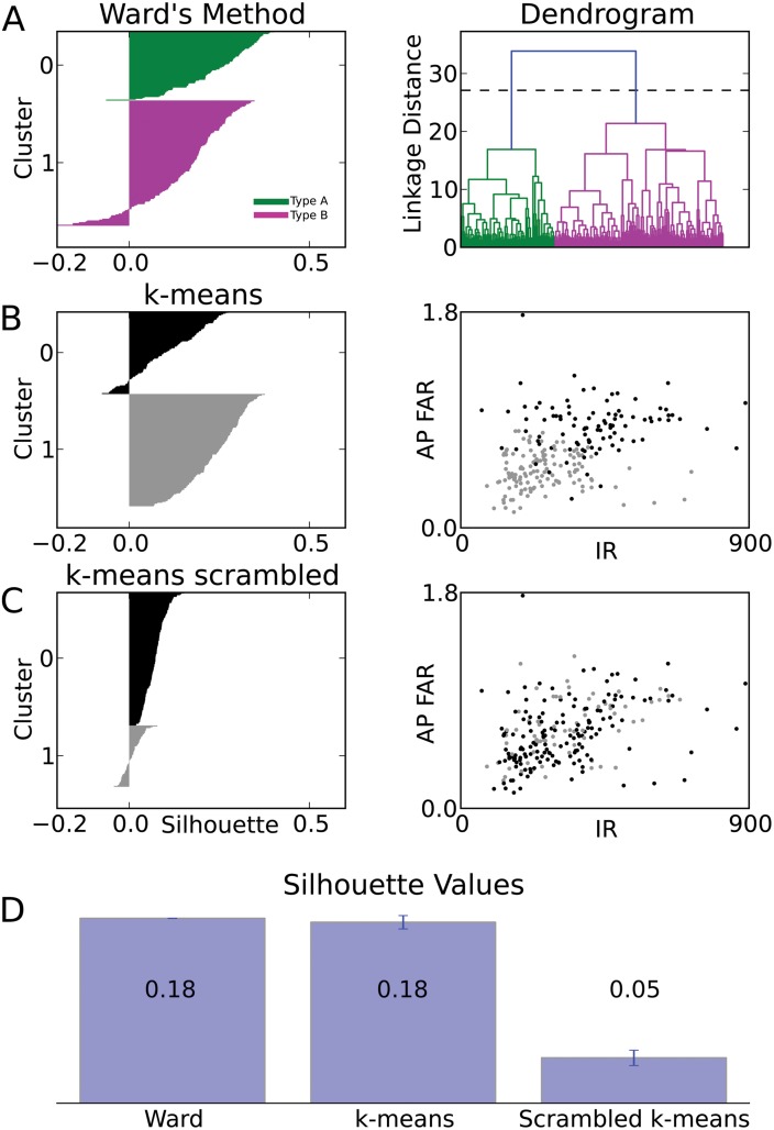
Fig 5. Comparison of clustering algorithms.
(A) Silhouette plot of Ward’s clustering. Within each cluster (green/A and magenta/B), cells are ranked (vertical axis) in decreasing order of their silhouette values (horizontal axis). Large positive silhouette values indicate that the data point is close to its cluster’s centroid, whereas negative silhouette values indicate that the data point is closer to the centroid of the other cluster. Right panel: The dendrogram from Ward’s clustering is shown for comparison. (B) Silhouette plot for one rendition of k-means clustering (k = 2). Right panel: The plot of clustered data points (black and gray) within the plane spanned by the input resistance (IR) and the action potential frequency adaptation ratio (AP FAR) illustrates the partial separation of data points from different clusters in this plane alone. (C) Silhouette plot for one rendition of k-means clustering (k = 2) on the scrambled data set. Right panel: The plot of clustered data points (scrambled data set) within the same plane of parameters as in C, reveals the lack of separation caused by scrambling. (D) Comparison between the average silhouette for the Ward’s and k-means (k = 2) clustering of the original dataset and the average silhouette of randomized databases. Scrambling of the data set causes a consistent loss of quality in the clustering. Error bar of the average silhouette for k-means clustering is evaluated by the SD over 1000 renditions of the original data set and by independent randomization for each rendition of the scrambled data sets.

