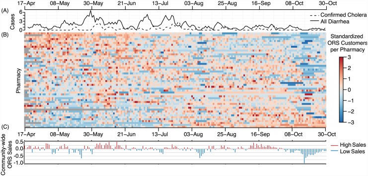
Fig 3. Smoothed epidemic curves for all diarrhea and confirmed cholera hospitalizations (A), standardized ORS customers by pharmacy (B) and mean community-wide excess ORS sales (C).
In Panel B, each row in the colored matrix represents the standardized sales trajectory for a single pharmacy with colored pixels representing sales for each day. Red pixels represent days with higher than expected sales and blue pixels represent days with lower than expected sales (grey cells represent days with missing days). Community-wide excess ORS sales (C) for each day is the average of these standardized values across all pharmacies.

